NuRange Cold Brew
Modern product packaging design delivers upon a well-crafted coffee brand
Overview
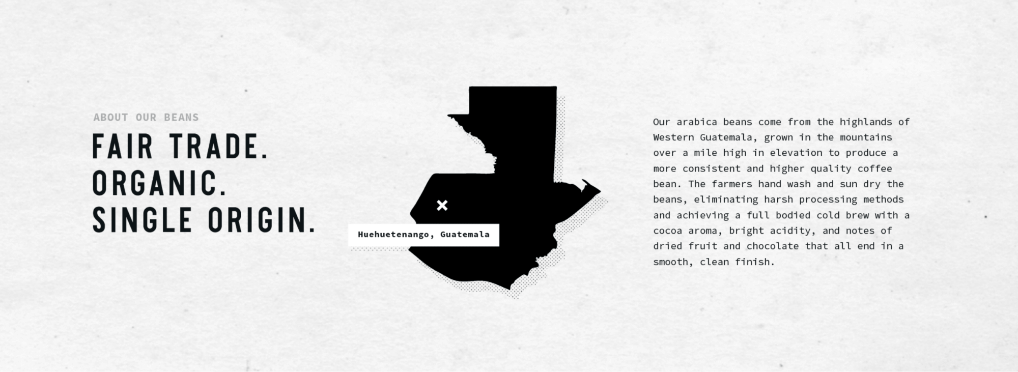
Brought to life from an obsession for the perfect Espresso Martini, NuRange Coffee exists to simply deliver the undelivered for coffee drinkers. They apply a “get-after-it” mentality and an obscene dedication for quality blends, giving coffee fiends nothing short of the best to pour in their coffee hole. Whether for fun, function or wellness, NuRange is here to fuel their customers’ daily grind.
Three Beans, LLC (NuRange’s parent company) sought out FlowState as a strategic partner for the creation of their go-to-market branding. They had developed a strong business plan in pursuit of launching a new line of coffee products that would successfully span the demands of their target audience. The coffee product market is highly competitive and the products are generally uniquely branded so that they stand out on shelves. Three Beans needed a partner who could set them apart with a strong brand and a creative ally they could trust to deliver the valuable assets (such as brand identity, messaging, and product packaging design) they would need to market their new brand effectively.
Our role
Brand Strategy | Identity Design | Packaging | Graphic Design
Challenges
When presented with an unbranded business, the possibilities are endless. That’s why it was crucial that we narrow in on what the company was hoping to achieve and who they wanted to communicate with. Three Beans, LLC had a name – NuRange – but little else attached to the brand, so we used our discovery process to collaborate closely with the NuRange team to build a comprehensive understanding of their business goals, values, competitors, and audience to fuel the creation of a powerful brand strategy. The goal was to carry this information across to collateral and packaging, reflecting a design-forward, minimalistic, and memorable brand. This provided us with a great opportunity to use our brand development and professional creative capabilities to deliver a brand identity that would drive rapid growth and long-term success for Three Beans, LLC.
Messaging
The first step in our process is to understand a company’s goals and purpose, after which we identify what we want to achieve with the messaging portion of the brand. Once those goals are set we deep dive into how we can achieve those goals using three, distinctly different messaging approaches. In this instance our approaches included “Grind Hard” (a reserved but unmistakable direction), “Coffee Companion” (a vocal, colorful and personality-driven take) and “Daily Revolution” (the outlier, a rebel direction that was noticeably set apart from the first two). All three represented a minimal yet bold and exciting messaging component of the brand. With each, we wanted to let the powerful brand elements speak in subtle, yet distinct ways.
Design
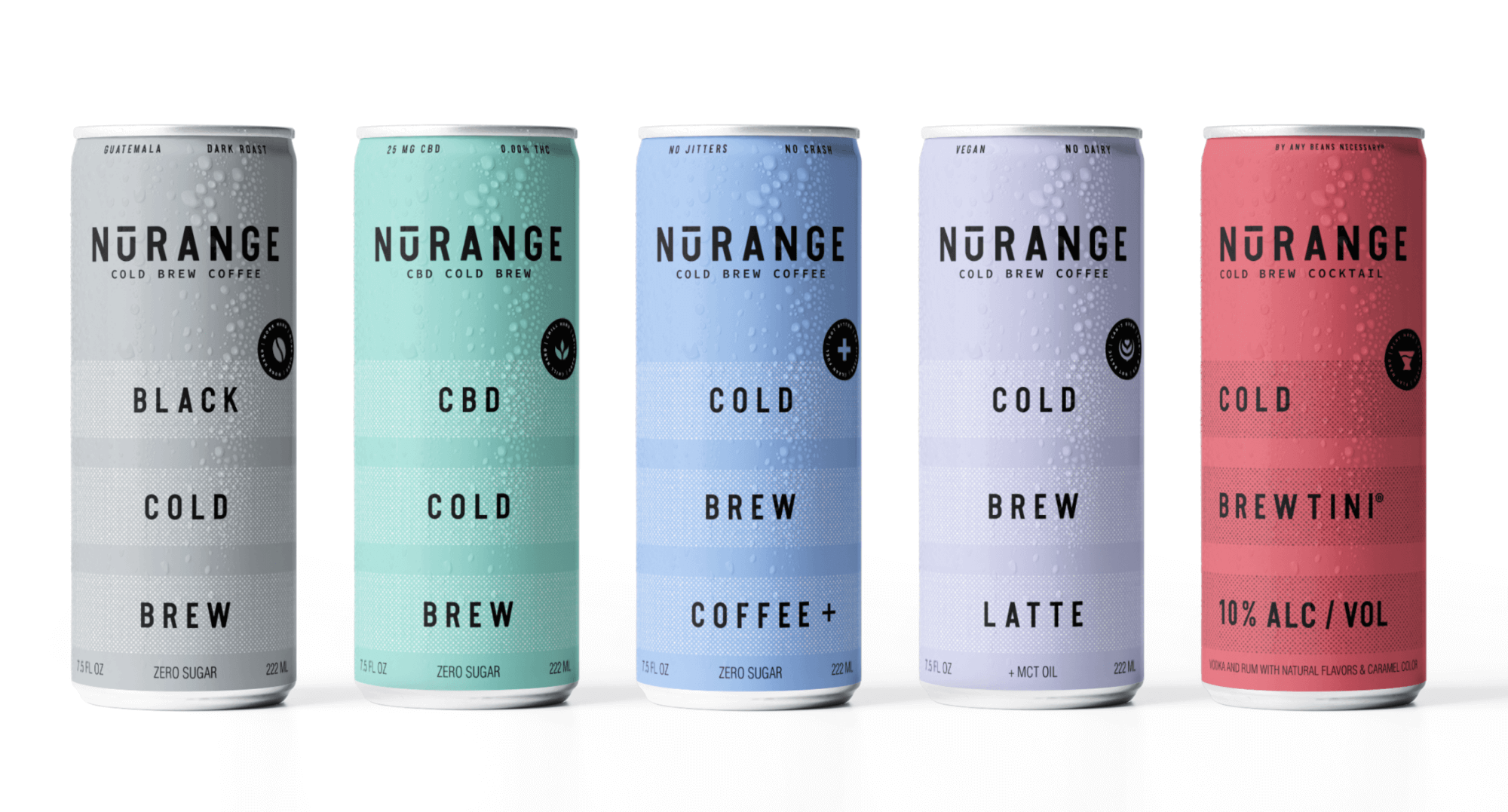
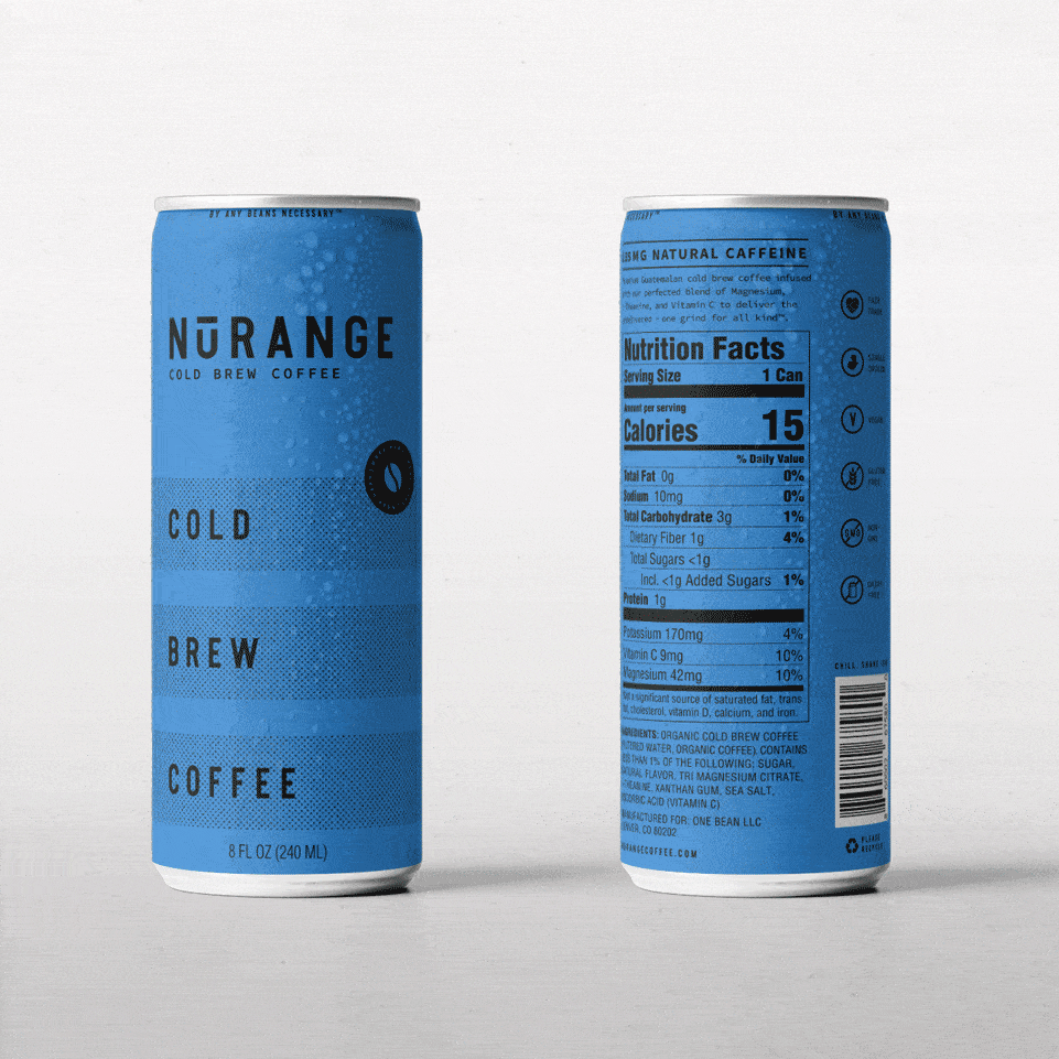
These components carried across to the designs which where also created with a minimalistic approach and aesthetic. This tactic was especially applied to the product packaging design of the coffee cans: we wanted to let the products speak for themselves through clear-cut and uncomplicated design. Stylescapes are key in helping us to relay our concepts during the design ideation process, and when we present our initial impressions of how the brand might engage via the messaging and visual identity. With the stage set, we honed in on a combination of the messaging and visual components between Grind Hard and Daily Revolution. Overall this was a clean and dynamic mix of those two directions which called on the look and feel, layout design, icons, and fonts from Grind Hard and the color palette, stripes, and the half-tone pattern of Daily Revolution. With the direction firmed up, we started to execute building brand assets and packaging design.
Packaging Design
It was during the product packaging design phase that the brand identity took on a slightly new direction. As we started to ideate how the cans might look and feel, both NuRange and our team initially envisioned carrying out the brand’s minimalism with a heavier, black and white focus for the product design. However, through our exploration of design variations, we collectively gravitated towards using colors more prominently on the cans. We ultimately landed on colored cans as the best expression of the brand, and a better way to connect with their audience. In presenting those options, we explored varied tones and depths of color, in the end slightly adjusting the original brand colors to achieve more distinction.
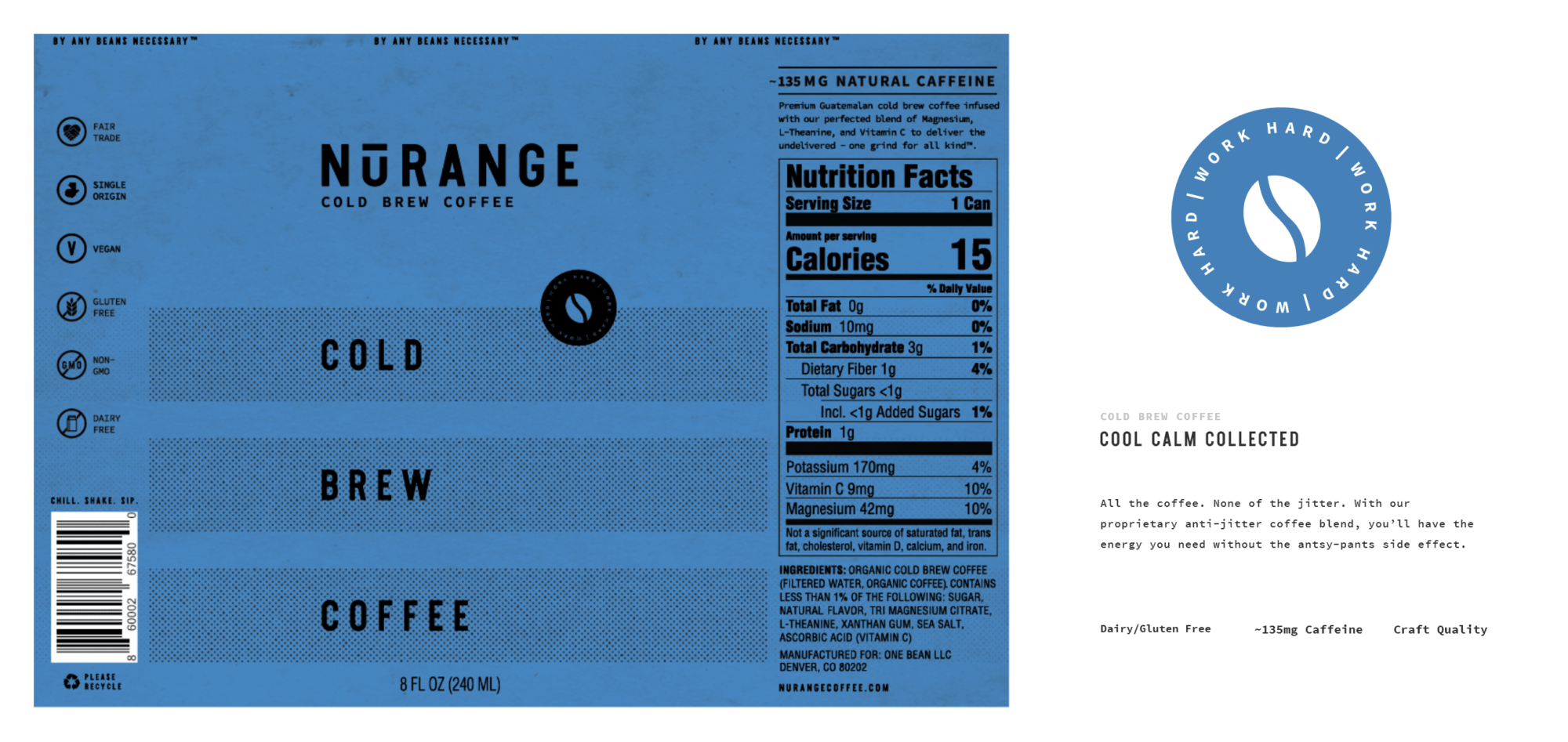
Brand Mark
Before finalizing assets, the client requested we explore a brand mark as an extension of the brand. A strong mark would be another way to communicate NuRange’s exciting brand visibility in more specific avenues, like on apparel, merchandise, and on their website. Though we created a few different options, there was a clear winner in the batch and we started to integrate the brand mark with the logo and other elements of the brand. With a clear brand identity and several critical brand assets developed, NuRange was ready to move forward in building a new coffee empire.
Results
NuRange brought passion and a commitment to collaboration to our partnership, and we met that commitment with the expertise of our team, our unique branding process, and our distinctive culture. Together we were able to create a thoroughly strategic and distinctly creative branding solution – including the packaging element which has become the centerpiece of the NuRange brand – that has truly delivered a grind for all kind.
RECOGNITION
Design Rush – Coffee Branding, Best Design Awards