The Egg
Creating a new brand and authentic identity for a classic mountain town breakfast restaurant
Sitting on a fresh new restaurant
A great brunch spot holds a special place in most people’s hearts, so we approached our work with The Egg of Estes with a special reverence for a local favorite. Once a single franchise in a national chain, The Egg needed to establish itself as an independent restaurant with its own identity and personality. They came to us to help define that identity, build them a modern and functional website, and to create a library of food and location photography to serve as the centerpiece in the advertising that would help reintroduce them to their community.
Our role
Brand Strategy | Brand Identity | Web Design | Copywriting | Photography | Menu Design
A brief incubation period
When we started our project together, pretty much the only asset The Egg of Estes had was their name. As we developed their identity, we wanted to leverage their fun and personality filled name in some way. After our discovery meeting and some strategic goal setting – making sure that we always kept the brand welcoming to locals, inviting to regulars, and highlighting the always made-to-order best breakfast in Estes Park – we developed 3 distinct identities.
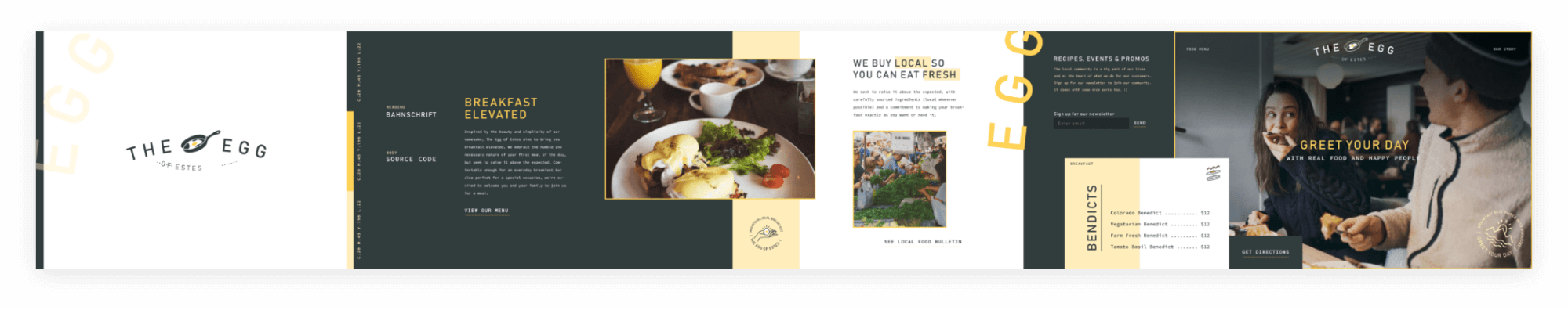
First we developed a highly playful direction, featuring bright accent colors, food puns, background illustrated elements, and focused on The Egg’s scratch kitchen.
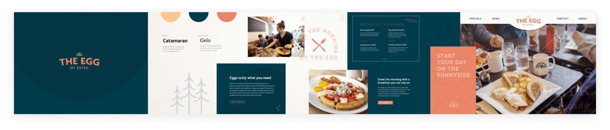
Our second direction positioned The Egg as an artisan experience, playing on the elegance and simplicity of the egg itself with a muted color palette, focus on lifestyle photography, and clean icons and logos.
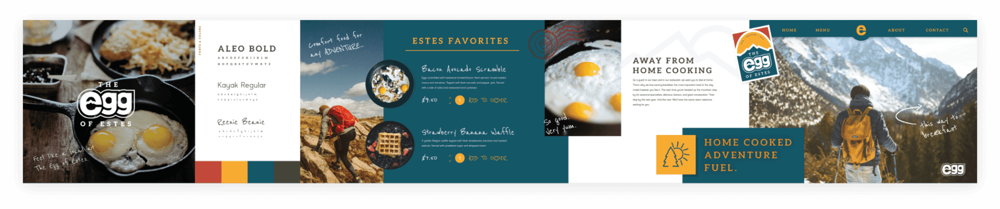
Finally for the third direction, we highlighted the outdoorsy vibe of Estes Park, appealing to the adventurous and active typical customer of The Egg with activity focused photography and positioning their meals as hearty adventure fuel.
That third direction – which we named The Adventure Egg – became the core of The Egg’s new identity, with some of the playful friendliness and more artisan elements repurposed from the other two. The logo became a perfect encapsulation of this combination – a playful representation of an egg cracking that features a stylized mountain range, which helped connect the name to the essence of Estes Park as a gateway to Rocky Mountain National Park. This direction felt engaging and affirming for the long-time regulars that The Egg wanted to keep connected to their new brand, while still staying inclusive for seasonal visitors and first-timers. With a clear identity developed, we started to bring The Egg to life.

Getting ready to hatch
Based on a quick timeline for transforming from a franchise location to an independent restaurant, we immediately got to work creating tangible brand assets that could be put to use right away. First on that list was their menu, updated with the new branding and a new brand story, as well as a fun and interactive kids menu to show off the truly family friendly environment of the restaurant. As a preliminary introduction to the new brand, we designed advertisements announcing the name change and beginning their re-engagement campaign in their community.
With the brand established and tangible assets out in the world, we started work on their new website. We wanted to deliver a site that was both an exciting expression of their new brand, but also featured a custom, user friendly backend so that The Egg could easily update and manage changes on their own. Based on their audience and how they were likely to use this site, we didn’t want to overcomplicate things. While the number of pages stayed relatively small, they were strategically developed for an engaging and organic user experience – all the most important information for restaurant guests is featured front and center, and we created a simplified way to display The Egg’s extensive menu with a clean UI that works well on both desktop and mobile.

After that we wanted to highlight some of the other elements of The Egg that make is a local favorite. In addition to the brand’s take on the core web pages, we also created an Ingredients page that showcases their commitment to using the best and mainly local products.
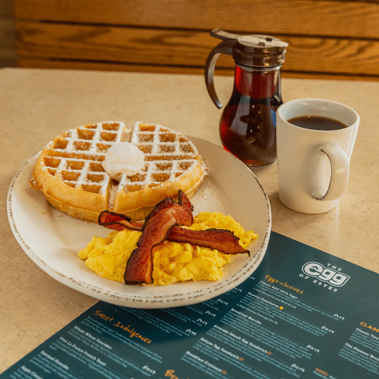
To really bring the website to life, we did a comprehensive photoshoot on location at The Egg to capture their signature dishes and lifestyle shots of guests and employees in the restaurant. From the framing to the interaction with the food to the editing of the images, we wanted to capture the warm and welcoming atmosphere of the restaurant and at the heart of the brand.
Starting things off on the sunnyside
Equipped with a distinctive new brand, functional brand assets, and a highly custom but easy to manage website, The Egg of Estes was ready to fully reopen with their new identity. Early feedback from the community affirmed the identity we developed – regulars still felt welcome, visitors to the town were immediately engaged, and the brand felt cohesive and unique in a way it never had before. The Egg has plans to continue to incorporate their new identity throughout their restaurant – including new decor, signage that can be seen from the main road in Estes Park, and custom merch – creating a truly branded experience for their guests.