DocBuddy
A new brand voice and identity for an innovative healthcare workflow app
A noble goal and a novel solution
A DocBuddy was founded as an innovative new solution to a major challenge in healthcare: providers spending too much time on administrative tasks at the expense of actual time spent with patients and their own lives outside of work. At DocBuddy’s inception, some providers were spending up to 2/3rds of their time on these administrative tasks, which created roadblocks at every step of the patient care process, from making appointments to ordering tests to final billing.
With a clear mission, a functioning app, and a basic website, DocBuddy came to us to redefine their brand voice and identity.
Our Role
Brand Strategy | Identity Design | Graphic Design | Promo Goods
Understanding the industry
We began our work with DocBuddy with an intensive discovery session to learn more about their goals, their identity as a company, and their space in the healthcare industry. Through this session, we learned that besides solving a difficult and pervasive problem in clinics and hospitals, DocBuddy had the additional challenge of trying to centralize and streamline the use of electronic medical records (EMRs), which are federally mandated but can be run by a variety of large companies. The healthcare industry is generally conservative and it can be difficult to introduce new solutions and technology, especially after providers had to adopt EMRs only a few years ago.
Balancing disruption and necessity
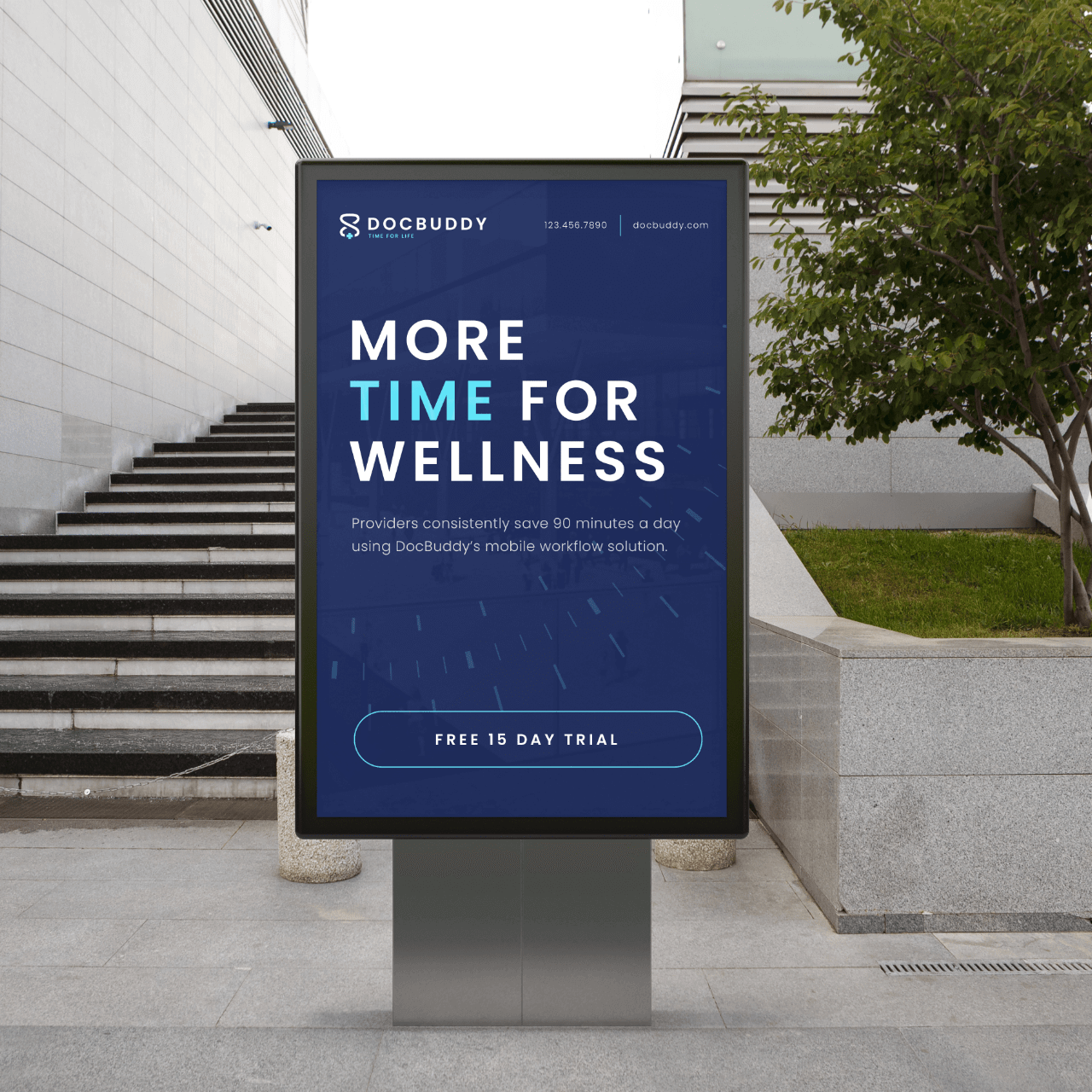
Because of their plans to bring a tech-based solution to a longstanding (and worsening) problem, DocBuddy was by nature going to be a disruptor in the healthcare industry. At the same time, the ultimate goal was to position DocBuddy as a necessity for providers in all aspects of healthcare. To bridge that gap, we worked with the DocBuddy team to distill their company’s mission and ultimate value proposition down to a single core word to be used throughout all the messaging and design: TIME. Ultimately, DocBuddy’s goal was to improve the experiences of providers, patients, and hospital staff by streamlining the patient care process and giving everyone back more time.
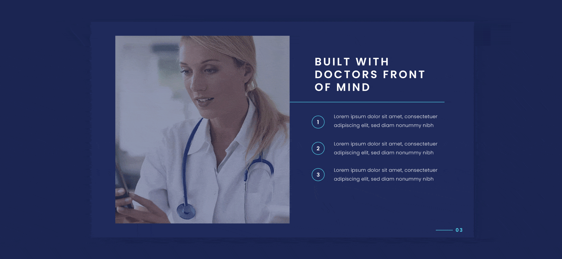
Designing to bring an abstract concept to life
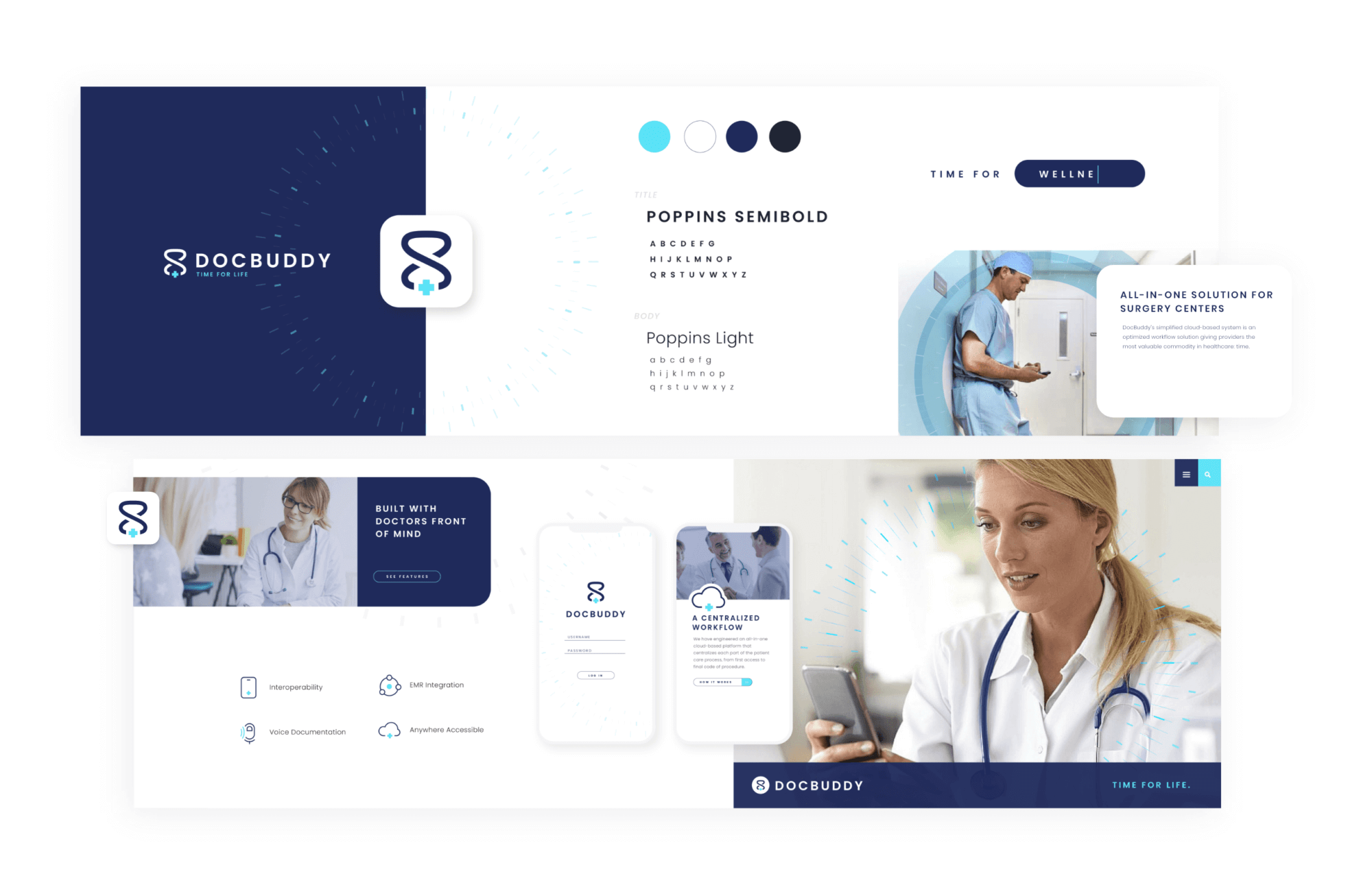
In creating the design, we wanted to keep that balance between disruption and necessity while finding different expressions – both abstract and more obvious – of the theme of “time” at the heart of the brand. We decided to use a color palette that was very familiar to healthcare – dark blues, teals, and whites – to help anchor this new solution to the existing industry, while keeping the simple, centralized, and tech-forward DocBuddy platform at the center of the imagery and written content. One element used throughout the brand design was a subtle nod to a clock face in the form of a primary and secondary chronograph, evoking both the themes of time and timelessness as well as tying the brand visually even further to the cutting edge science of medicine. The logo itself is a minimal and free-flowing mark also derived from classic symbols of time and medicine while achieving the staples of a timeless logo by maintaining recognition across a diverse range of proportion and color.
Extending the brand voice
With a strong brand identity established through both messaging and design, we began the process of developing a full information architecture and writing web-ready copy for DocBuddy’s new website. We worked in tandem with the website team at Kreativa, who took our structural recommendations and created wireframes which we then populated with our brand-aligned and foundational SEO optimized copy. That website package, along with our newly developed brand guidelines, was handed off to Kreativa’s development team, resulting in seamless collaboration and a fully brand-aligned website.
Prognosis is good
Though in some ways a niche technology solution, DocBuddy’s potential impact in the lives of providers and patients is huge. Creating a clear brand identity, built on a strong foundation of discovery and collaboration, gives DocBuddy what they need to scale ambitiously, bringing their time-saving solution to the hospitals, clinics, and surgery centers where it is truly needed.