Grip Logic
Creating a personality driven identity for an app that’s redefining the way we interact with restaurants, bars, and gyms.
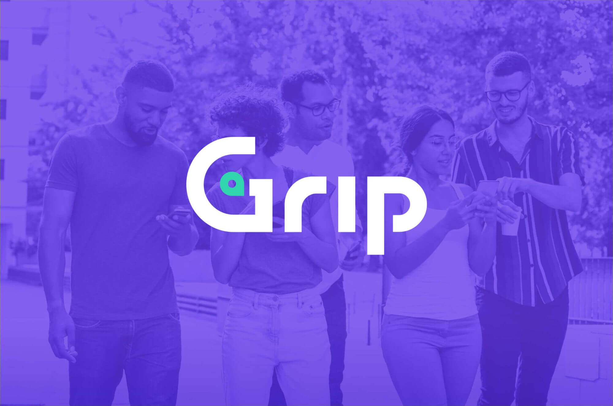
Matchmaking, but for experiences
Grip Logic is a full reimagining of the way that businesses – specifically bars, restaurants, coffee shops, and gyms – and their customers find each other. Grip believes that misplaced and mismatched expectations are what cause unhappy customers, so their app connects customers to the experiences they’re looking for, creating a better time for all. Instead of relying on star ratings, they let users search for places and experiences by vibe, choose from a personalized list of recommendations, or by using one of their other tech-forward features, like checking out the ambiance before heading out the door with live video feeds. Grip came to us with their company founded and an app in development, but in need of a clear identity for their brand, so that they could start bringing the right people and the right places together.
Our role
Brand Identity | Brand Strategy | Collateral Design | Copywriting | Video Production
Discovering an authentic Grip
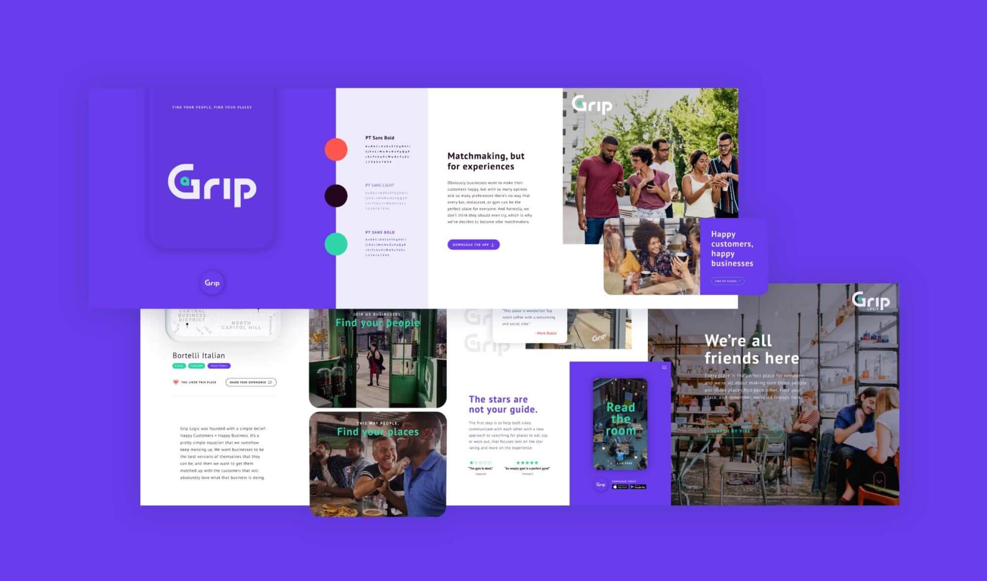
Though they had a strong product and service offering and a specific problem they were trying to solve, Grip needed to define and establish a highly thoughtful identity. They admired the clean confidence of other tech companies, but still wanted to keep a more human element at the heart of their brand and messaging. They also made it clear from the beginning that they were not afraid of bold color choices, but wanted to make sure whatever main brand colors we chose would appeal equally to both women and men, businesses and consumers. The Grip platform is relevant to a wide audience, so it was important to appeal to many different types of potential customers, all while creating distinction from competitors and generating a sense of excitement and engagement. With all that in mind, we developed three bold and distinct versions of their brand identity.
Finding a Goldilocks fit
In exploring an identity for Grip, we wanted to present them with strong and differentiated versions of that identity to see what felt right. We created one version of Grip that was full of HUGE personality and incorporated a lot of humor in both the messaging and in the imagery – a fun and poppy consumer focused expression of the brand. We also created a sleek and techy identity that communicated an immediate confidence and was focused a little more towards the business owner side of their audience. Ultimately we landed on an identity that felt just right: an open, endlessly positive, and friendly brand identity with an impactful color palette and some unique visual elements to help set Grip apart. This version pulled in elements from the extremes of the other two directions: poppy and progressive enough to appeal to younger audiences, but user-friendly and engaging enough to feel inclusive for older or less tech-savvy users. It also kept the appeal to a wide variety of businesses, by being simultaneously cool, clean, and inviting. Within this direction we uncovered a key aspect of Grip’s identity, a welcoming attitude and commitment to transparency that makes everyone – businesses and app users alike – feel like they have a place at the table.
Pinpointing a logo
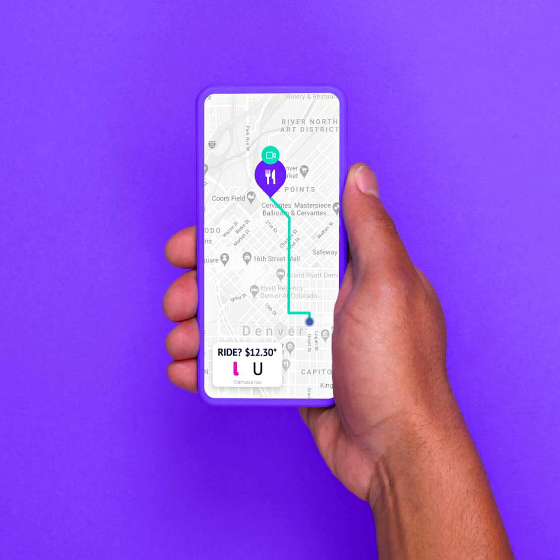
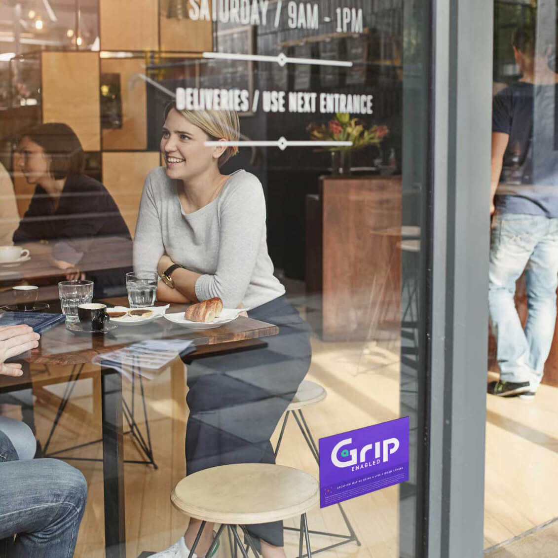
Logo development is always an important element of creating a brand identity, but it took on an extra importance for Grip. Their logo needed to be memorable and versatile, and it also needed to work as an app icon and as a window sticker – in the same vein as Yelp or OpenTable – for any location that uses their service. Beyond the vibe matching and personalized recommendations, Grip also helps app users find restaurants, bars, or gyms near them, and has a built-in integration with ride sharing apps that streamlines the process of finding a place to go and calling a ride. On the business side, there are location-based and verified insights for business owners that help improve the quality of the feedback that they receive from customers. We wanted to include some element of their location based services in the logo, and landed on a slightly abstract representation of a location pin as an accent to the G in Grip. This simple accent helped to elevate the logo, adding visual interest and impact to the otherwise straightforward wordmark, and also created an additional design element that could be used on their website, within the app, or on marketing materials.
People, meet Grip
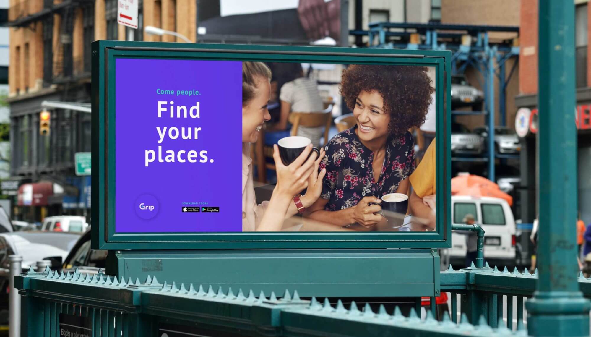
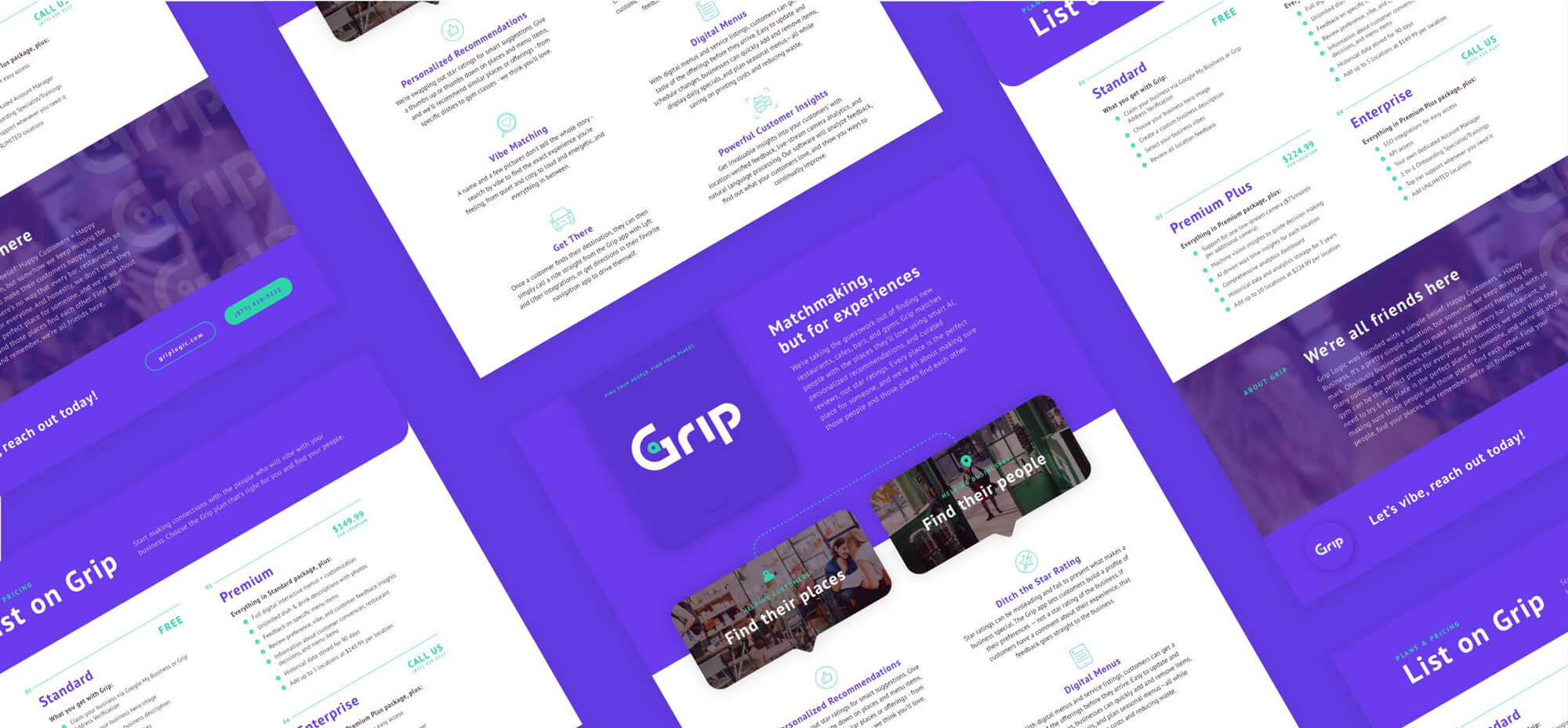
With a clear brand identity established, it was time to help introduce Grip to the world. As a new and somewhat disruptive service and app in an already crowded industry, they wanted an introduction that would make an impact. We developed a versatile video that showcased all the features of their app in an abstract way – with a stylized representation of the UX/UI a user could expect – that could be cut down into shorter clips for Grip to utilize in a digital awareness campaign. This video is all about personality, and serves the dual purpose of introducing the world to Grip the app, and Grip the brand. As a final extension of the brand messaging, we developed content for a basic website to help support them through their initial launch and future growth towards the need for a strategic full site design and development.
Good vibes only
Our collaboration with Grip resulted in a well defined and personality driven brand designed to easily communicate with a wide audience. Armed with a clear identity, a high-impact video, and assets to support their launch, Grip was ready to enter the scene with confidence and the ability to quickly grow their business and service.
RECOGNITION AVA AWARDS – Platinum for Short Form Web Video