- DateAugust 7, 2019
- AuthorFlowState Branding
- Post TypeStrategy
The Use of Color Psychology in Branding, Strategy, and Graphic Design
We know now that color psychology explores how color influences our behavioral responses. When used in branding, marketing or graphic design, different colors can impact the way a consumer perceives and interacts with a brand. An example is how certain hues can increase appetite.
In a study titled ‘Impact of Color in Marketing, researchers found that up to 90% of snap judgements made about products can be based on the color alone (product dependent). Further, that “people make up their minds within 90 seconds of their initial interactions with either people or products”. The findings of the study were that colors can be used to “increase or decrease appetite, enhance mood, calm down customers, and, reduce perception of waiting time, among others”. Results from studies such as ‘The Effects of Color’ further demonstrated the clear relationship between brands and color including perceived appropriateness of the color for the product, while additional studies have revealed our brains tend to favor recognizable brands, which makes color choice a key element when creating a new brand identity.
In the paper ‘Dimensions of Brand Personality,’ Psychologist and Stanford Professor Jennifer Aaker pointed out 5 core dimensions which play a role in brand personality. Brand personality is defined therein as “the set of human characteristics associated with a brand”.
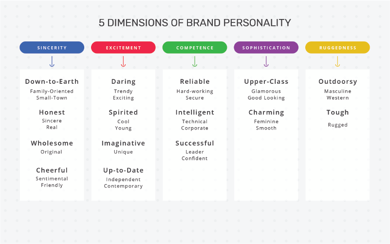
Brands can sometimes represent more than one trait, however more often than not one particular trait will dominate. Utilizing color theory, “a practical combination of art and science that’s used to determine what colors look good together,” in your design process can help to communicate multiple traits, or add helpful context to the primary color of the brand. While certain colors align with specific traits (for example red for spirited), it is important to consider the impact of generalizations in your decision making. For example it is possible to make the traditionally rugged brown feel warm and inviting when it is considered in the context of Thanksgiving marketing.
This Color Emotion Guide ties in a number of brand personality traits with existing brands showing how they’ve used color psychology to relay a specific message, feeling or call to action.

What Color Choice Implies

Used by Target, Kellogs and Coca-Cola, red evokes strong emotions, increases appetite, and symbolizes passion and love and intensity. Key descriptors include survival, alertness, urgency, and safety. “62-90% of shoppers make snap judgments based on the influence of this color”.
![]()
Engaged by McDonald’s, Subway, USPS and more, the color yellow stimulates mental process, communication and cheerfulness. It is highly visible, draws attention to itself and represents optimism and youthfulness. Use it carefully however; too much yellow can cause an anxious response in consumers meaning its use should be carefully considered and purposeful.
![]()
Employed by Facebook, Oreo, HP, and American Express and associated with water, the color blue represents calmness and serenity creating a sense of security and trust in a brand. It’s also the preferred color for men and is known to inspire loyalty.
![]()
The color orange is used in marketing to influence impulsive buyers; which may explain why it’s a color utilized by Amazon, Home Depot and Payless. It’s often used to create a call to action, and reflects enthusiasm, excitement and demonstrates warmth.
![]()
A color used to denote nature, health, serenity and tranquility. Also representing new growth, it creates a relaxed feeling and is used by Spotify and Whole Foods, among others.
![]()
In marketing this color is used to soothe and calm; it’s the color of royalty, success, wealth and wisdom. Used by Taco Bell, Craigslist and Yahoo amongst others, purple is the perfect blend of blue’s stability and red’s energy and power. For this reason it’s one of the most used colors in the creative industries.
![]()
Implemented in branding for Adidas, Apple and Puma, Black is the color of sophistication, mystery, power and control. Due to it’s sleek feeling it is often used in marketing high end or upscale brands. Black is a color that emotes a similar response across most cultures, meaning it’s a great color to use to draw attention to your brand in a subtle manner.
![]()
White is used by some of the most notorious brands such as Google and EBay to create contrast and space. It is the color of clarity, freshness and creativity and denotes cleanliness, purity, safety and when applied correctly can project neutrality. It adds breathing space and minimizes the design feeling ‘crowded’.
Humans are visual creatures. We’re attracted to, or repelled by color, light and imagery. In the case of branding, marketing and graphic design, the psychology of color plays a key role in decision making. While choice of color sets the mood for what you design, the real challenge lies in the color scheme you choose, whether for brands, marketing, websites or graphics. The hardest part isn’t finding the right colors; it’s knowing how to implement those colors to relay your message clearly and concisely.
First published on 10/01/2018 – updated on 8/07/2019 with a new color selector tool from Canva