Pinsight
A leadership assessment company driven to remove bias from the hiring process.
Pinsight is a leadership assessment and development company with a straightforward yet powerful mission at their core: to remove bias in the hiring and promotion process, leveling the playing field and allowing true talent to shine through. Detailed leadership assessment has been a part of hiring and succession planning in some industries for decades, but these assessments had traditionally (and expensively) been done in person, with assessors using live role-plays and their own subjective opinions about candidates to make recommendations.
Pinsight has reimagined this process, offering a more modern and scalable solution with a fully virtual platform that can be accessed from anywhere in the world, as well as personality and problem solving elements that make their assessment much more objective. With a new research study about to be published and big plans to grow their company, Pinsight came to us in need of a brand update and a new website to help support them in their goals.
Brand Identity | Web Design | Content Strategy | SEO | Responsive Development
Young, Disruptive, Forward Thinking
As a newer company challenging the traditional model for leadership assessment, Pinsight needed to be able to highlight not only that their assessments were as accurate and comprehensive as their competitors, but also that moving to a fully virtual model had additional benefits. Their main value proposition – less expensive assessments that were far easier to scale – was straightforward enough, but communicating that value required a deliberate approach.

Refining What’s Working
Our work with Pinsight began with our typical discovery process, but also included members of our team completing their leadership assessment, giving us an inside look at the experience and value of their service. With a greater understanding of their platform, we began working on a brand refresh that more effectively communicated their position in the competitive landscape of their industry.
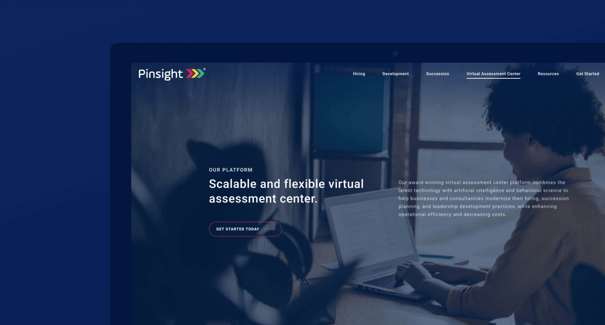
Pinsight is all about helping companies be more forward thinking, identifying true talent, and giving employers snapshots of their employees’ skills and development. Their logo – three arrows pointing to the right – and main brand colors – red, yellow, and green – did a good job of communicating what Pinsight does in some literal and more abstract ways. Instead of creating a new logo and color scheme, we refined what was already working, focusing on a greater utilization of their existing logo, and updating the colors to a more modern feeling palette. Combined with a dark navy background color, these elements came together to communicate a straightforward confidence to help continue to propel Pinsight forward.
Restructure for Clarity
By nature, Pinsight works with big concepts and complicated processes, helping organizations manage those elements more efficiently. We wanted their new website to reflect the way that utilizing Pinsight’s platform and expertise made those concepts and processes more manageable.
As we moved into the website design, we developed an information architecture for the site that distilled the Pinsight platform into elements that were easy to understand. Our goal was to help potential clients identify their needs and explore other facets of Pinsight’s services they may not have considered before.
We identified the three core applications of Pinsight’s platform – for use in Hiring, Development, and Succession planning – and used those three categories as the foundational structure of the site. From there, we started bringing in the human element on both sides of these assessments. We focused the imagery on the site not on the tech itself, but on the people using and being affected positively by that technology, creating an organici association.
From the Literal to the Abstract
While we wanted to give visitors to the site some insight into what the Pinsight assessment and leader development app looked like in action, we found that screenshots of the assessment and app interface were actually somewhat limiting. Instead, we developed more abstract representations of what assessment participants would experience and icons that showcased major features and value props.
As the full site design came together and we moved into development, we were finally able to incorporate an engaging and interactive element we’d been excited about from the beginning of the project: animation of the arrow design throughout the site as another subtle nod to all of the different ways the Pinsight platform can be used. Some of the animations run no matter what, but others are activated by scrolling over specific sections, encouraging visitors to the website to explore and interact. The playfulness of this element also helps to distinguish Pinsight as a new and progressive voice within an industry that has historically been more traditional and conservative.
Moving Things Forward
Part of the goal for this website project was for its launch to coincide with the publication of a new research study Pinsight created in partnership with George Mason University and Purdue University. The new site and this study marked an important step in Pinsight’s growth as a company and position in their industry. Ultimately, the sleek simplicity of the website design helped to communicate Pinsight’s tech-forward platform with a unique and innovative confidence. Their new, highly interactive and intuitive website will help to support Pinsight in their continued growth as they carve out their own distinct space in the leadership assessment industry.
RECOGNITION MARCOM AWARDS – Platinum for Website