Butcher Bird
Productions on the cunning edge
Setting the stage
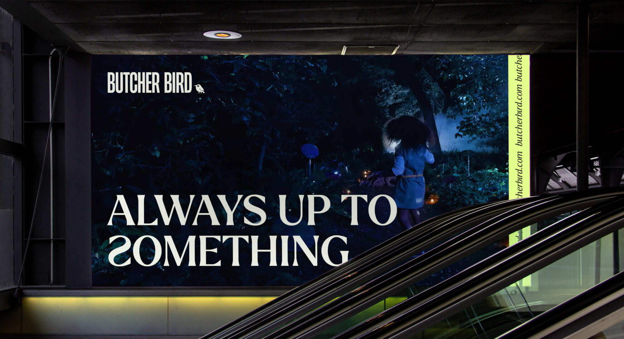
Butcher Bird Studios is a branded content studio that harnesses cutting-edge technologies to craft captivating content for renowned brands like Netflix, Amazon, Twitch, and more. With a focus on innovation and creativity, Butcher Bird has set themselves apart in the industry, continuously pushing boundaries to engage audiences in unprecedented ways. While ideally Butcher Bird’s work could speak for itself, their brand didn’t represent the personality of the studio or clearly position them as creative partners for their clients. We collaborated with Butcher Bird to uncover a truly unique brand identity that is equal parts professional and kooky, creative, and occasionally spooky.
“It was clear from the beginning that the team really listened to us, and on the creative front, it felt like they truly pushed the boundaries of what our brand could be.”
– Creative Producer, Butcher Bird Studios
Branding is for the birds
Butcher Bird Studios is named for a real creature: the shrike aka the butcher bird. Shrikes are distinctive and creative tool users, adorable little birds that spear their prey on spikes and thorns. We were inspired by the inherent and slightly creepy surprise represented by these birds and explored an identity that captured some of that same feeling.
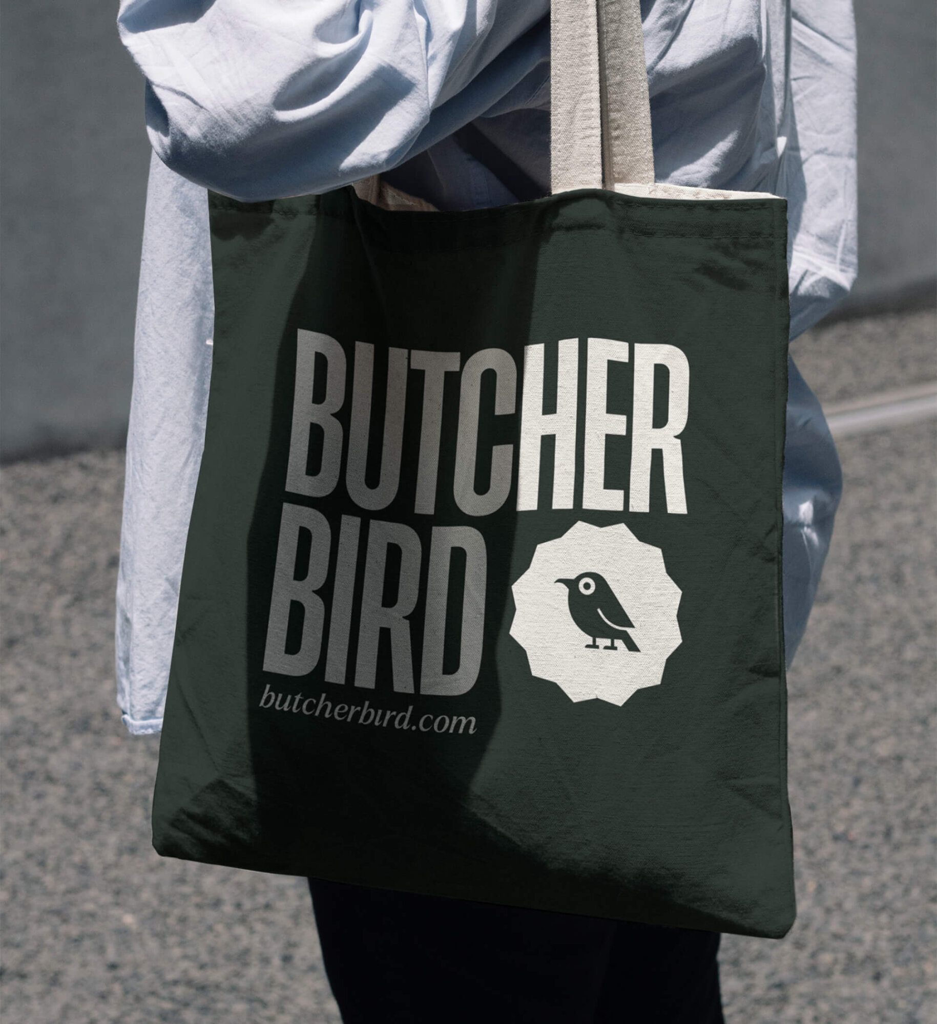
One key piece of that identity – and for providing context to the studio’s name – was the logo. We created a distinctive yet versatile personality-filled bird that works equally well as part of the full logo mark and as a stand-alone branded element. We paired the crafty creature with a dramatic, oversized wordmark that provides a strong and grounding balance to the whimsical mark and the face of the brand.
Maximalist Minimalism
Bird in hand, we established a simple black and white color palette for the brand that made it easy to showcase Butcher Bird’s ever-growing library of branded work. To add additional distinction and versatility to the brand, we used bold and high-impact secondary colors that amplify the playfulness without undercutting the professionalism of the work.
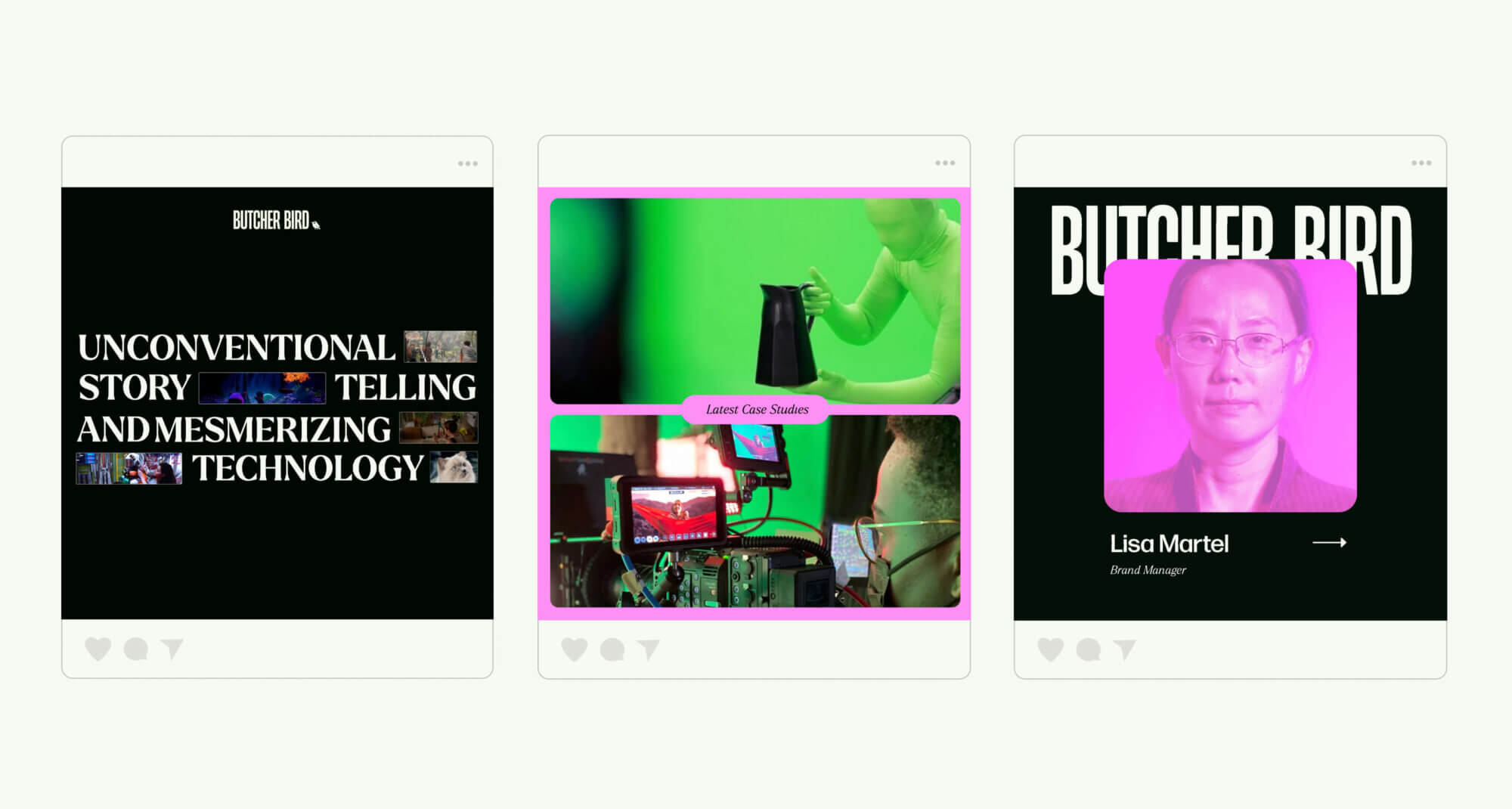
Finally, we developed a brand voice that is mischievous, mysterious, and witty, designed to keep visitors to the site engaged and entertained as they learn more about Butcher Bird’s specific technical capabilities and past partnerships.
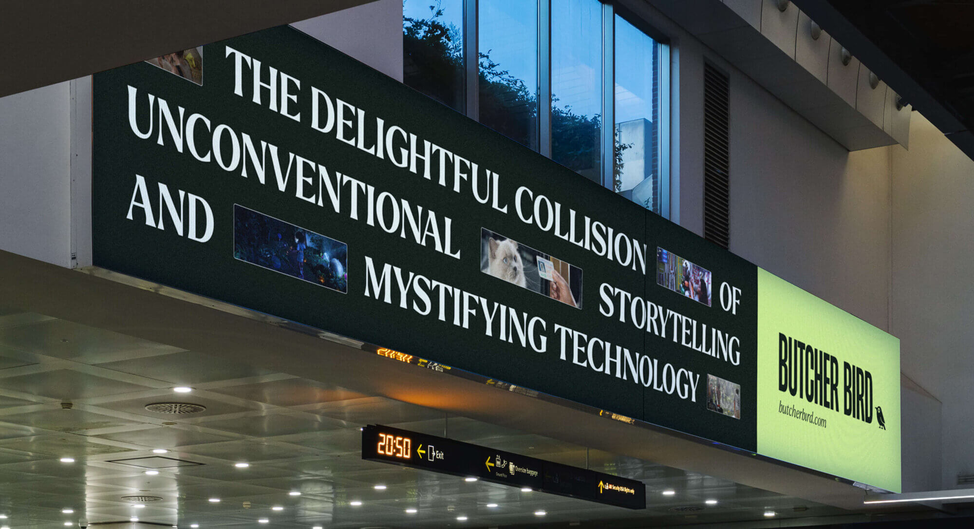
“The look and feel of the company finally represents the high-quality people and work we have at Butcher Bird Studios!”
– Creative Producer, Butcher Bird Studios
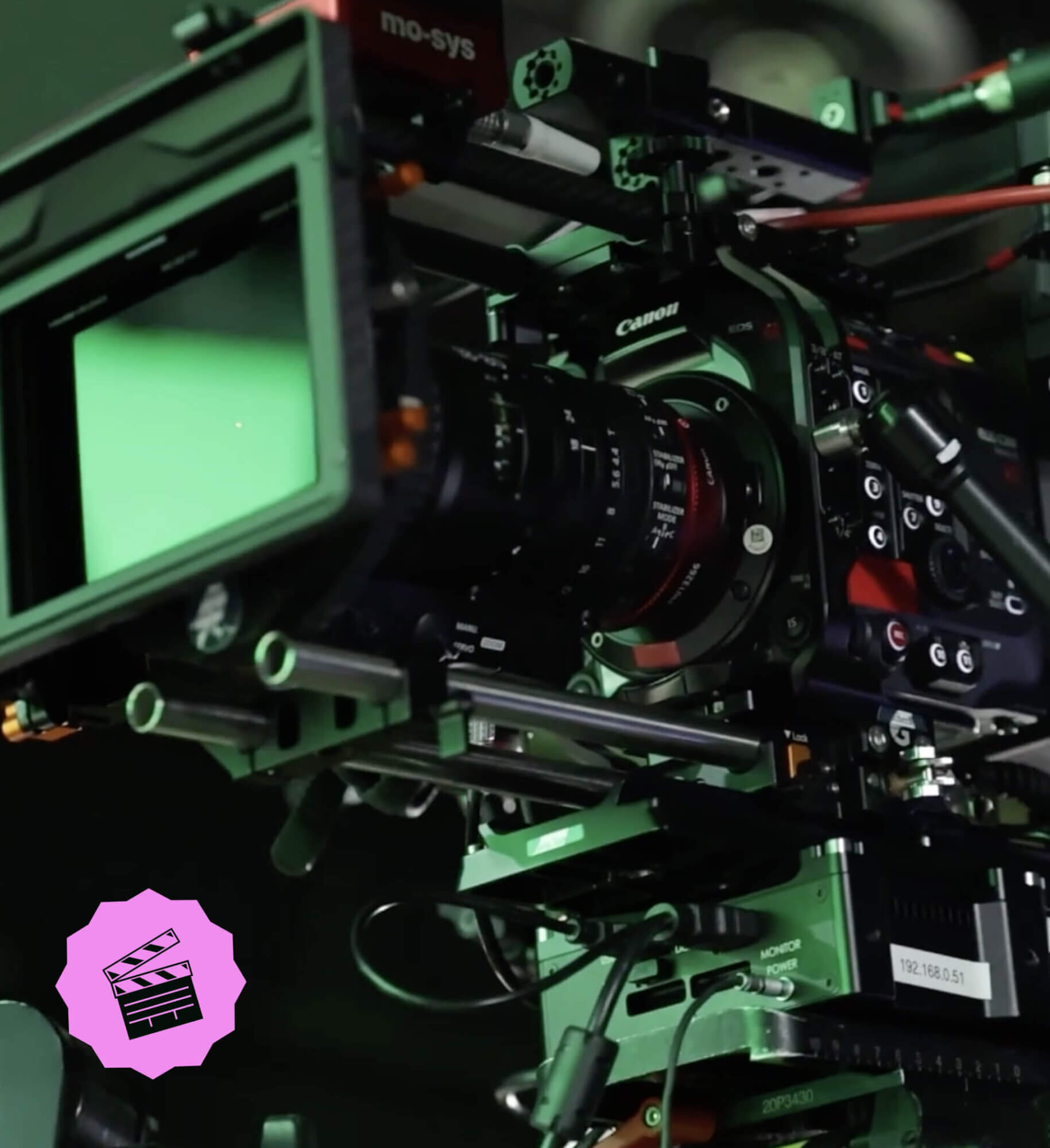
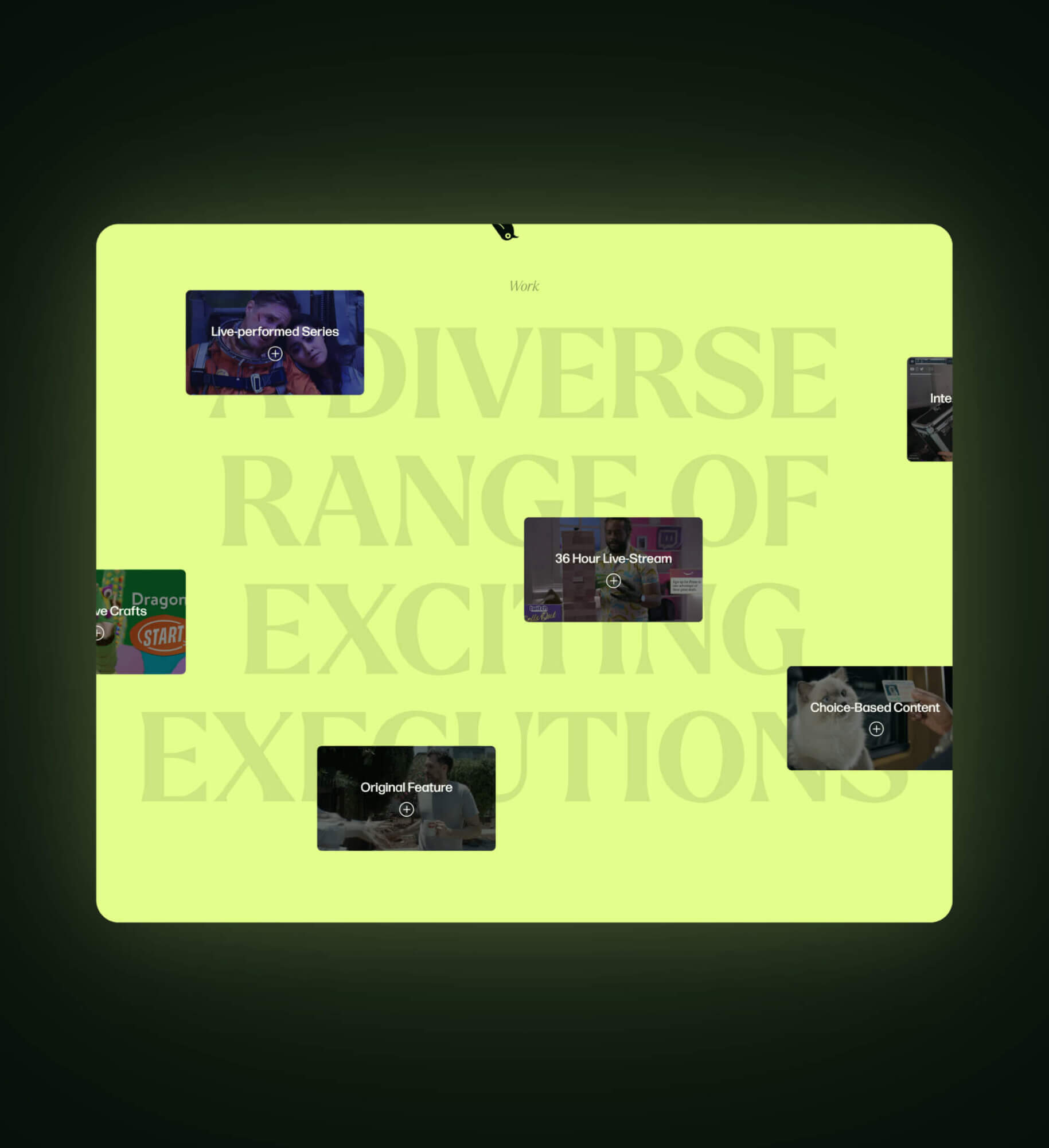
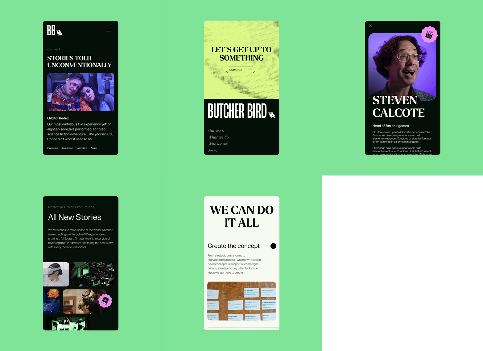
As we moved into website design and development, our focus was always on how best to showcase Butcher Bird’s innovative work and technical prowess. High-quality video content, pulled directly from the studio’s portfolio, played a pivotal role in telling the story of the brand’s capabilities and the impact of their projects. Case studies highlight the studio’s signature collision of storytelling and tech to create engaging and memorable experiences for audiences, while a new expression of just what makes the Butcher Bird team tick (underscored by team features and company highlights) personalizes the studio and positions the brand as a true partner to their clients instead of simply a skilled vendor.
Taking Flight
Engaging, surprising, wacky, and wonderful – Butcher Bird’s brand identity now matches the vibe of their studio, the creativity of their team, and the quality of their visually stunning and technologically staggering projects. Since launch, they’ve received positive feedback from their clients and partners. Beyond the initial splash of their rebrand and new website, the brand is now set up to scale and grow, taking on even more ambitious work for their clients while continuing to explore their own original IP with a truly unique new home online.
“In short: you and your team f***ing rocked!!! What a beautiful journey together to bring something truly wonderful to life.”
– Partner & Director, Butcher Bird Studios