Secret Stache
A web development firm dressed to impress creative agencies
Secret Stache is a white-label website development agency that provides highly collaborative and comprehensive development services. Though well-established with a solid client base, Secret Stache wanted to take their presence in the industry to the next level to attract new, long-term partnerships with creative agencies. They came to us in need of a full rebrand and a custom website that would showcase their capabilities while aiming to impress their target audience: highly creative design agencies.

Finding Distinction in a Diverse Arena
We have worked with Secret Stache for several years as one of their agency client partners, so as we began this project we had the unique experience of having our roles and relationship flip. Now that they were our client, we wanted to help Secret Stache stand out as a quality development solution that would attract other creative agencies for long term development partnerships. Secret Stache in some ways has few direct competitors – there aren’t many other agencies who offer the same highly custom white-label web development services. Instead of direct competitors, Secret Stache has to stand out amongst a wide variety of development solutions – everything from low-bidding freelancers (who often lack the resources to get the job done) to inflexible and templated WordPress chopshops to overextended in-house developers.
To make Secret Stache truly stand out we pursued a strategy that would develop a progressive and authentic identity, avoiding current trends, recent fads, or anything else that couldn’t grow and scale with the business.


A Not-So-Secret Identity
As a company, Secret Stache was not afraid to showcase some big personality – that alone would help them stand out amongst their direct and indirect competitors. They were interested in exploring bright colors, unique graphics, and juxtaposition between design and copy to create a singular and highly branded experience. We built our messaging strategy around three distinct strategies:
First, an irreverent and playful direction built around the “secret” in their name, featuring a bold tone and color choices, and unique graphics. We also explored a direction that focused more on the excellent and comprehensive service Secret Stache provides to all of their clients, toning back the color palette and the voice and tone slightly. Our third direction highlighted Secret Stache’s deep dedication to building long-term relationships with clients and agencies with the goal of becoming their “forever firm.”
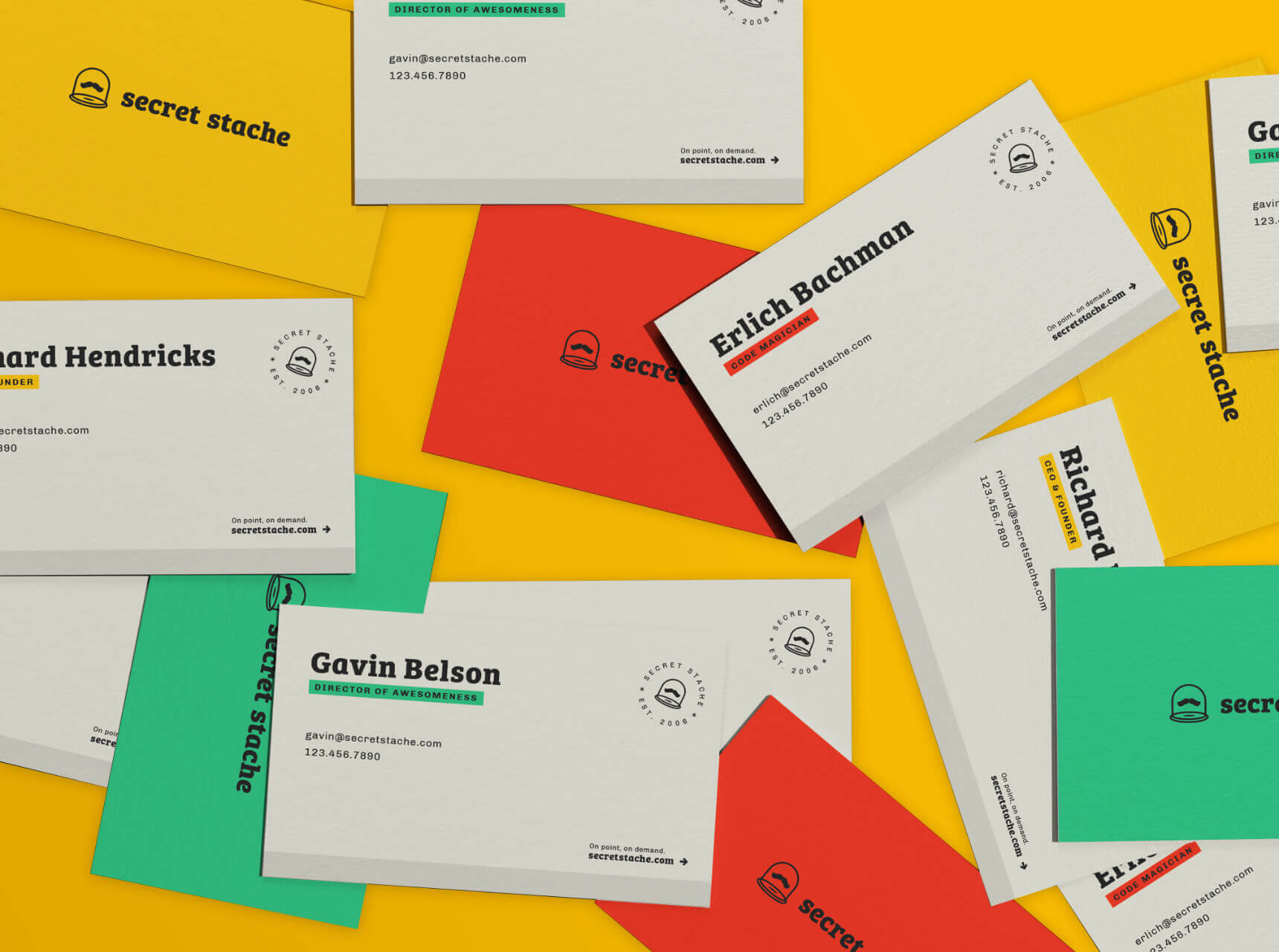
Ultimately we landed on a brand identity that represented a nice combination of our bold and irreverent first direction and our relationship focused third, with a punchy, funny voice that is balanced and softened slightly by focusing on Secret Stache’s dedication to building partnerships with their long-term clients.
Wrangling the ‘Stache
At this point we were excited about the identity we had developed, but we were still working towards a final new logo for the brand. The name Secret Stache came from an old inside joke the founder of the company shared with a friend (classic ironic mustache humor of the early 2000s.) Secret Stache wasn’t tied to keeping a mustache or a mustachioed face as a part of the logo, but through exploration we found that separating the name from some sort of mustache imagery left the name feeling disconnected. Once we decided that we needed to include a mustache in some way, we explored ALL the mustaches. We tried using brackets to represent a stylized mustache that also had a connection to coding, we explored splitting up the two sides of a mustache to create something a little more abstract yet still recognizable, and we tried different styles of mustaches on a variety of faces – nothing was quite working.
Ultimately our exploration led us to a concept for the logo that felt deeply tied to the brand identity in that it was both very literal and straightforward AND had a zany playfulness and energy. We selected a timeless mustache shape that perfectly fit our creative concept of mystical encasement with an illustrated element we had developed for the brand, and then there it was – our Secret Stache.
Pulling Out All the Stops
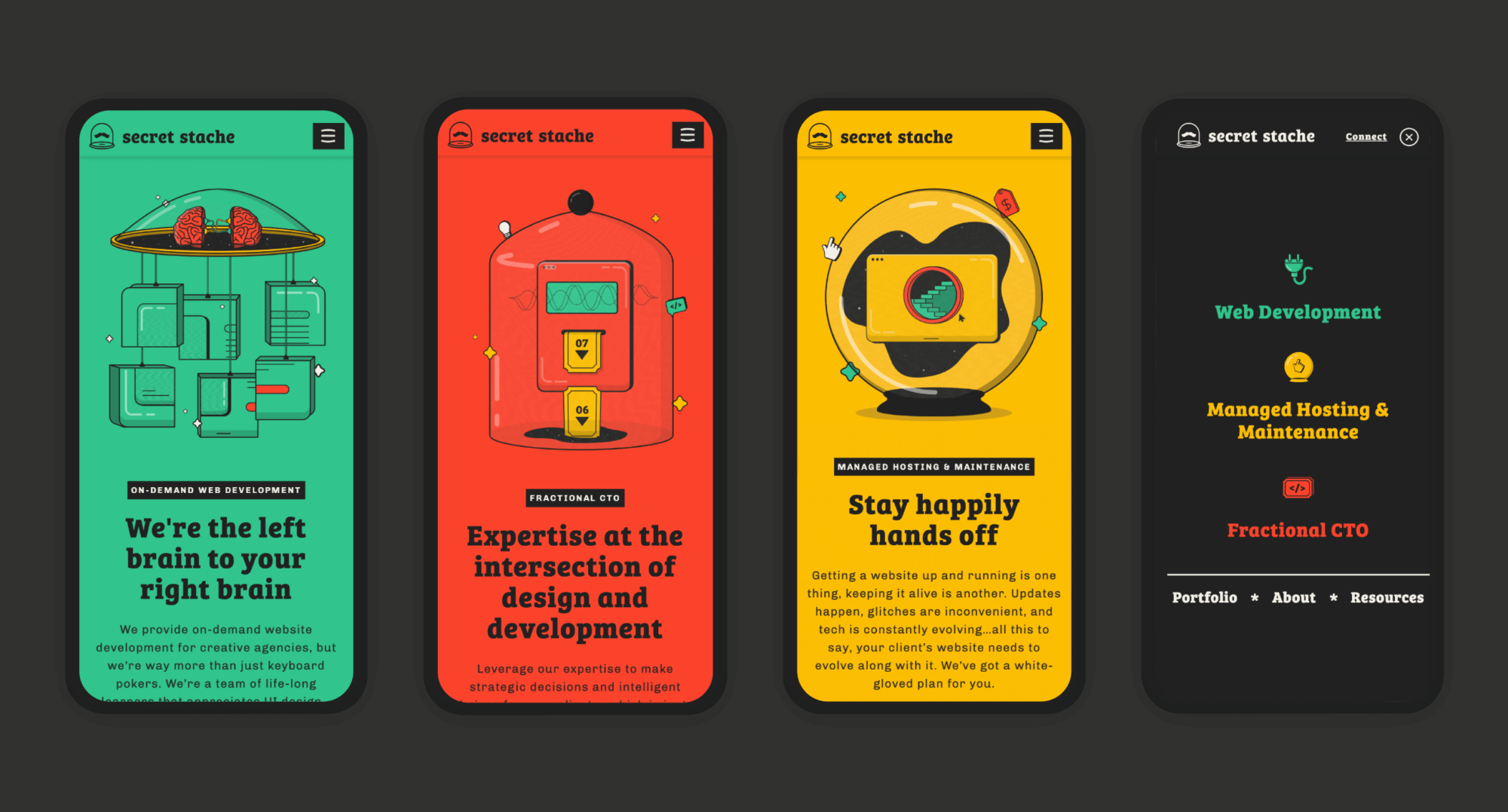
With a strong new brand established and memorable new logo, we were ready to extend the brand to a new website. Though our designs and strategies are always fully custom, because Secret Stache would be developing and managing their own site we had the unique opportunity to push the customization of the site. A major goal of this project was to create a website that Secret Stache could use as a showcase of just how much they can do in development, so they encouraged us to pull out all the stops and test the creative limits of the website within the brand we had created.
Beyond showcasing their development prowess, we also infused Secret Stache’s fun personality and punchy new brand identity into our design and strategy. Using the unexpected, strange, and mystical components of the brand, we leveraged every opportunity we could find to animate, hide an easter egg, or add an interactive element. To further apply the brand, we created engaging, weird, and personality-packed copy that delivered a branded balance between education and entertainment.
Our goal was to build the site that was full of surprises, creating an engaging experience that encouraged visitors to explore. We also wanted to use this exploration of the site to help better qualify leads before any potential clients reached out. To accomplish this we built a highly simplified yet informative user experience that strategically led visitors to the information they sought.
The Final Flourishes
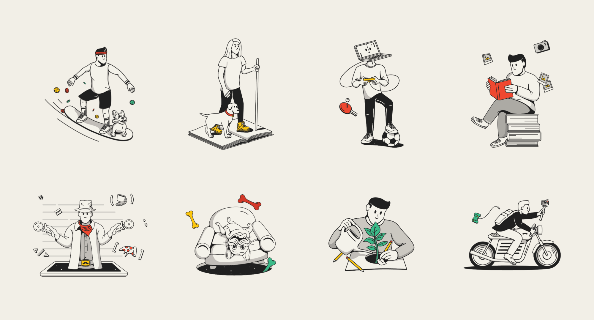
Animated elements had always been part of our design plan, but as we neared the end of the project we decided to punch those animations up, especially in the headers of the main content pages. Like the rest of the website, these animations balance humor, engagement, and useful information to provide a truly unique experience on the Secret Stache website. Finally, as a way to connect the people who do the actually coding to the fantastical and fun designs, we created a photo treatment and a personalized illustration to showcase the full team (including key team member Frankie, #TheMostComfiest.)
The response has been very positive within the industry, from existing creative partners to brand new exposure – in fact, within an hour of launching an ad campaign that featured the new brand and lead to the new website, Secret Stache received two highly qualified leads. Secret Stache has always been a standout development agency based on the quality of their work, but with their distinctive, memorable, and eye-catching new brand they can stand out to a whole new set of clients and continue to grow in an ever changing industry

RECOGNITION
Awwwards – Honorable Mention + Mobile Excellence
The One Club Denver – Merit Award for Branding
World Brand Design Awards – Nominee
AWA Awards – Platinum Web Design
Marcom Awards – Platinum Web Design
Orpertron Web Design Awards – Site of the Month
Design Rush – Interactive Web Design, Best Design Awards