OneStone
Centering the people at the heart of an ecommerce agency
“We have more than doubled new client meetings. The leads we have are more qualified and educated than ever before.”
– Scott Sinclair, Senior Director of Ecommerce & Business Development
Overview
OneStone is an ecommerce management solution, helping brands optimize their product offerings across online platforms with a comprehensive suite of services. Though they had a strong foundation in traditional retail and goals to grow not only their clients’ businesses but their own, OneStone was held back by their simple website and identity, an extreme juxtaposition to the friendly, helpful, dedicated, and fun team at the heart of their company. They had the additional challenge of working with a wide variety of clients – all with different education levels about ecommerce solutions – necessitating a site that served a broad audience. Though they offer each of their services individually, OneStone wanted to focus on the benefits of their full service solution, but without chasing away any potential clients who maybe weren’t yet all in for that level of partnership. Our challenge was to bring these disparate and under-defined elements together in an authentic and powerful way.
Our role
Web Design | Copywriting | Brand Identity | Collateral Design | Motion Graphics
Big Personality, Bold Ideas
From the beginning of our work with OneStone it was clear, this was a company with a lot of personality and they weren’t afraid to use it in the pursuit of some major changes to their brand and presence online. A key element of refreshing their identity was developing a new logo that was more enticing, timeless, and connected to the company.
While the name OneStone was developed to contain several meanings – the keystone to a business’ ecommerce success, the single element that could tip the scales of ecommerce – it was originally meant to evoke the story of David (smaller brands) and Goliath (big retail). Evolving those concepts, we extrapolated an orbital-centric logo to capture both the idea of David swinging a stone, and key service values of OneStone: a client-comes-first mentality and all-in-one offerings.
SOME METRICS
220%
increase in average time on site
>2X
increase in qualified client leads
Dynamic, Interactive, Engaging
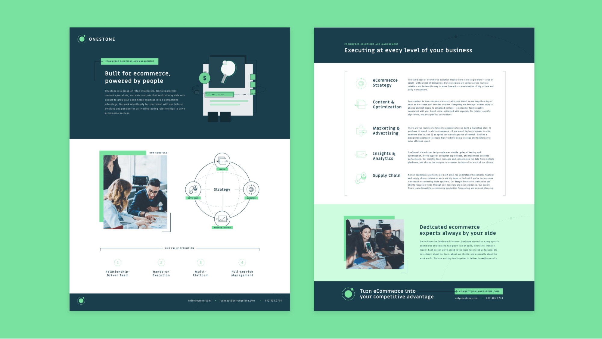
From the strength of the logo and the implicit sense of movement it contained, we expanded and developed a highly interactive, engaging, and energetic brand identity. We generally stayed within an adjacent color palate to their former brand, but looked for opportunities to push those colors into a dynamic vibrancy that made the brand feel more alive. We then chose fonts that both evoked the tech space of ecommerce while keeping the brand feeling fresh and professional. For the graphics across the site, we pursued a design direction that was both simple and impactful, incorporating the circular theme from the logo into illustrative elements and icons that represented OneStone’s individual services.
These elements helped to make OneStone’s individual service offerings clear, but also helped draw connections between each service and the powerhouse that is OneStone’s full service approach. By keeping the graphics and even the highlighted products featured in more abstract – creating recognizable but not fully identifiable products to represent their wide-ranging services and expertise – we designed a consistent, branded experience for an audience that can range from one-time projects to years long partnerships.
“In our interviews post website launch we have noticed that applicants have a greater understanding of what OneStone is from our offerings to our culture – they understand what is important to us. This has led to clearer and confident interviews for both OneStone and applicants.”
– Emmy Evans, Human Resources

Built for Ecommerce, Powered by People
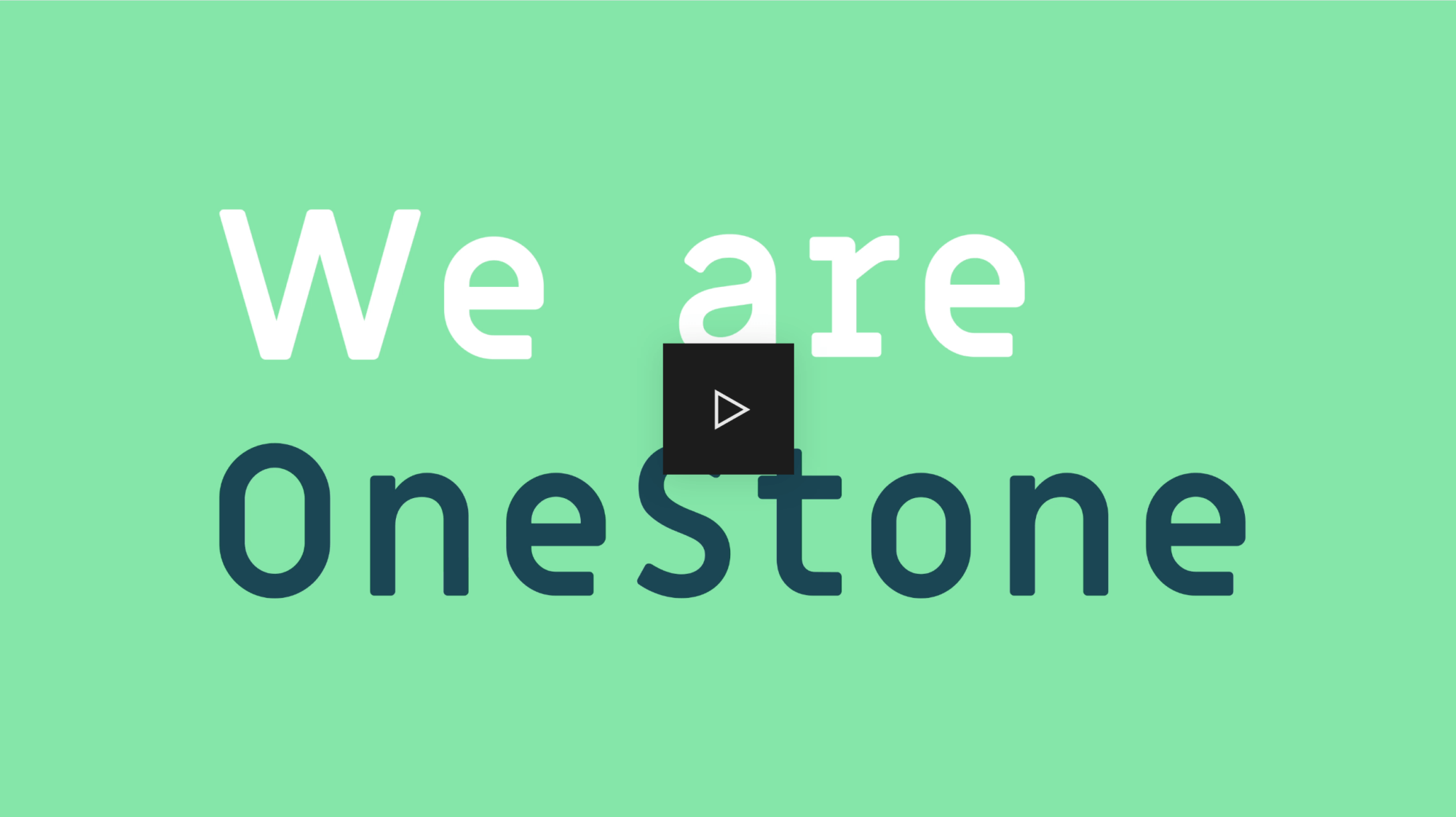
The timing of this brand refresh and new website development was connected to OneStone’s 3rd anniversary, which gave the OneStone team the opportunity to debut their new identity with energy and fanfare. We created a video introducing their team and all of their clients to the new OneStone which premiered at a full company meeting – attended by everyone from the founder to their newest interns – to the literal popping of champagne. This event marked a clear new beginning for this quickly growing company, and created an atmosphere of excitement, inclusion, and buy-in from their dedicated employees.
While all of our projects are deeply collaborative between our team and our clients, OneStone’s brand refresh and new website stands out for how deeply involved the OneStone team sought to be. Their input at every phase of the project helped them to own the new identity we developed for their company and empowered us to push them towards a more vibrant and progressive online presence. As an industry, ecommerce is experiencing explosive growth, and with their authentically developed identity and strategic new website, OneStone is set to grow alongside it.
“The new branding and website has moved OneStone into a tech forward company that is easy to understand. This is difficult to do.”
– Creative and Branding Partner

RECOGNITION
AVA Awards – Web Design, Platinum
AVA Awards – Short Form Web Video, Gold